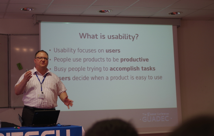
The curtains are up on GUADEC 2014, and the first keynote was delivered by Jim Hall. Jim is the Director of Information Technology at Morris, University of Minnesota, and he presented his work on usability in GNOME. We took some time to talk to Jim about his keynote and about his research on GNOME.
Nowadays many designers are interested in user experience rather than usability. Do you believe that usability alone is still relevant?
Usability and user experience are related, but different. Usability is about getting something done; user experience is about the user’s emotional impression. Lots of things can affect the emotional experience of a graphical desktop like GNOME. Colors, fonts, location of elements, and window decorations are just some of the things that can influence how a person feels about using GNOME. That’s the user experience.
Usability focuses on the user. The general rule about usability is that people use programs to be productive, and they are busy people who are trying to get things done. Through usability testing, the user decides when a product is easy to use. Because if a program is hard to use, no one will want to use it. And if they don’t use the software, then they won’t have an emotional experience about it.
So I believe that usability and user experience go hand-in-hand. Programs need to be pleasant (user experience) but people need to be able to use them, too (usability).
In your experience, what are the biggest difficulties you can incur in arranging an user testing?
It is critical to plan a usability test around the users. Who are the users? Do you only expect programmers to use it, or is it intended for a general audience? With GNOME, that means everyone, so any usability test of GNOME must be designed for “general users with average knowledge.”
The next step is to decide what tasks those users need to do in GNOME. What are these general users trying to get done? In this usability test, we wanted to focus on new design patterns, but we first had to work out a set of tasks that real people would probably do: manage some folders and files, browse the web, take some notes, and so on.
Once you figure out what the usability test should cover, the hardest part is to make sure the tasks are realistic. You want each task to be something a real person would probably do in GNOME. But avoid using words or terms that actually appear in the program. That would only test if the user can match your task description to a menu item. Instead, you want to describe things using general terms. For example: when I asked testers to increase the font size on a website, I didn’t use the word “font.” Instead, the task was:
“You don’t have your glasses with you, so it’s hard to read the text on the website. Please make the text bigger on the website.”
You have done a lot of work on improving usability in GNOME: what was the hardest issue you found and the biggest satisfaction you have got?
I was really glad to see Allan and the other GNOME folks create entries in the GNOME Bugzilla. It’s really satisfying to see GNOME developers taking usability seriously.
In doing the usability test, it is hard to watch someone struggle to complete a task. You can’t give hints; you almost have to sit on your hands to keep from saying “the menu item you’re looking for is right there.” You must let the tester explore for themselves, in order to understand how users interact with your program.
I was surprised by some of the test results. For example: installing a program using Software. When testers searched for the program (“Robots”) they got a list of programs that matched the search, and a convenient “Install” button they could click. But if they navigated through the categories to find the program, the “Install” button was in the upper-right corner, and users didn’t see it. Instead, they clicked on the link to visit the program’s website, which got them totally off track. So testers either completed this task very easily, or they were not able to do it at all.
What do you expect from this GUADEC?
This is my first time at GUADEC, so I really don’t know what to expect. I have attended other similar conferences, so I expect to meet lots of interesting people. I am a very friendly person, so if you see me, please do say hi.
While I’ve visited other countries, this is my first trip to France. Unfortunately, I don’t have any French, so I am hoping someone will help help keep me from getting lost. I also speak conversational Spanish and a little bit of Klingon, but neither will help me in France. 🙂
Can you give us a quick introduction to your GUADEC keynote?
My keynote will be a summary of my usability research with GNOME. This is based on my Master’s capstone project, which you can download from my blog: “Usability Themes in Open Source Software.”
The presentation walks through the usability test of GNOME. I think folks will be very interested in the “heat map” of the usability test, which shows how testers fared in the test. It’s a new way to share results of a usability test, and I think it helps to make issues more clear.
I will wrap up with a discussion of five themes from this usability test: how GNOME developers can extend this usability test to help them with other GNOME programs.
Many thanks to Jim for all his work, and for his excellent keynote presentation.

